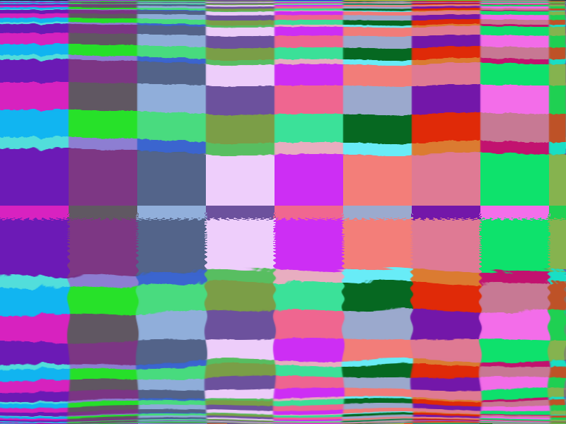
"bruh" or, what if pretty color
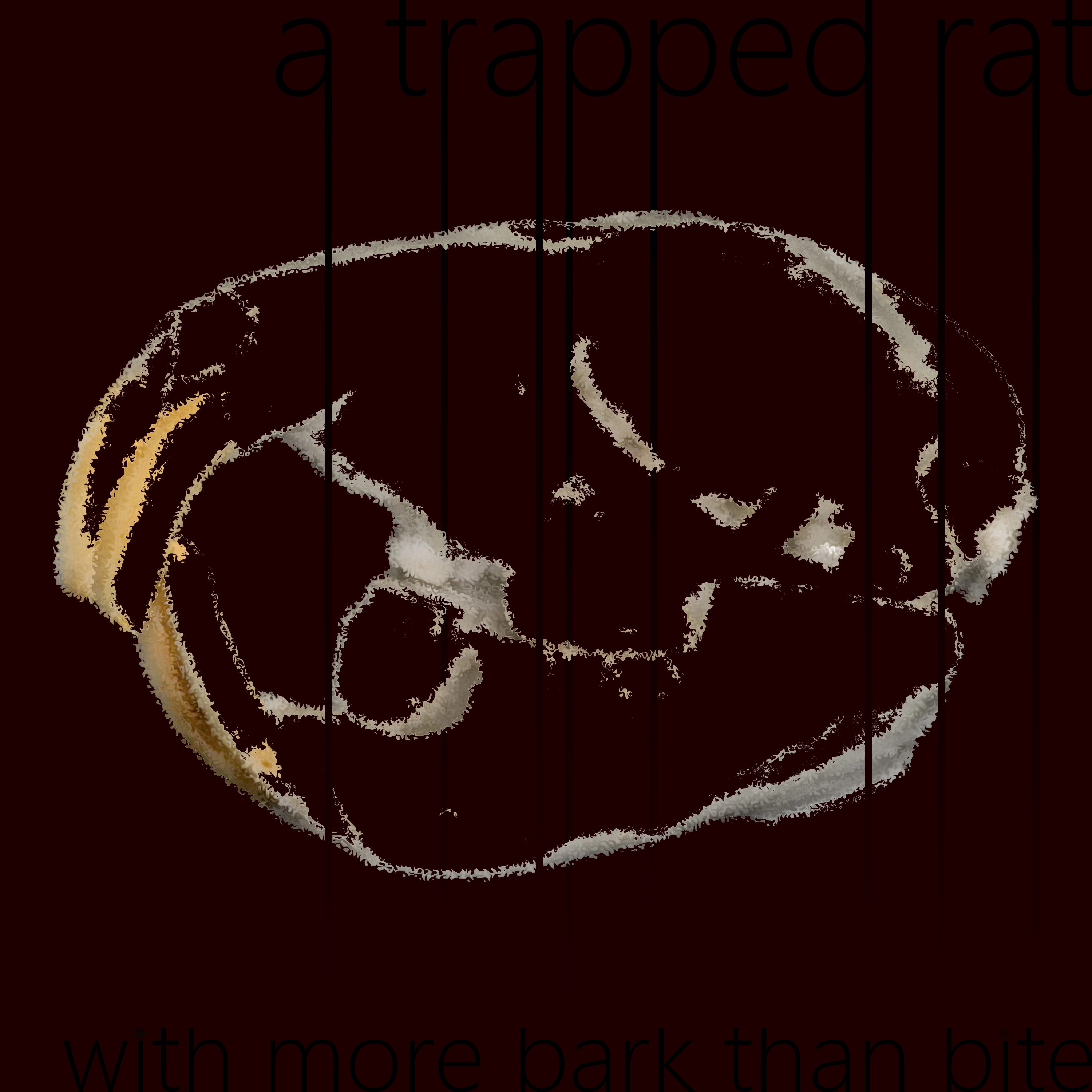
"a trapped rat with more bark than bite", this and the next one were made october 2020. this one was just for a little modular synth thing i made, and it inspired the next one.
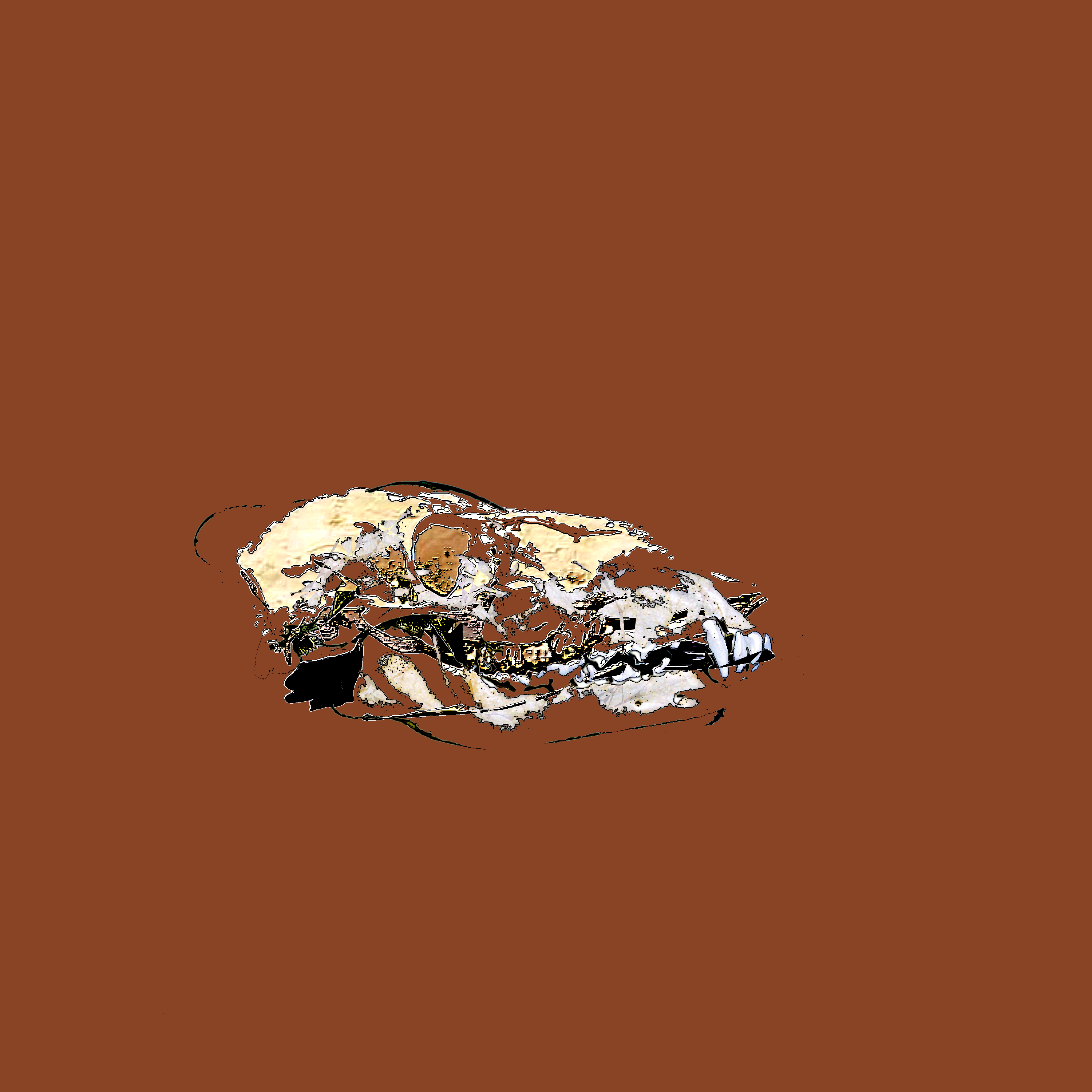
"death" wow it's about death. the skull is of a deer. for some reason this color orange just makes me think of death...
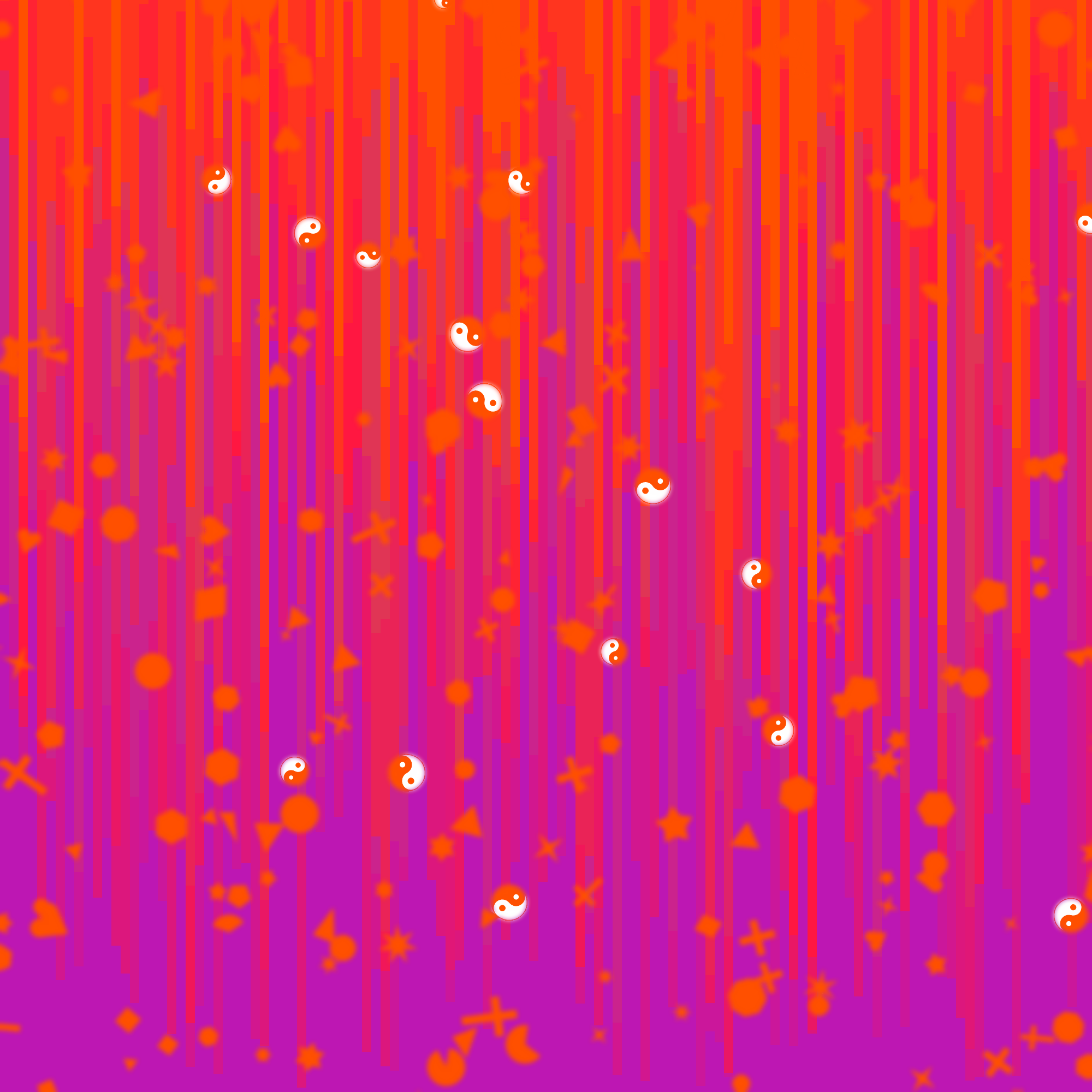
"dnares" made a little sparkly modular track while in a discord call with my friend dnares (shout out dnares) and i made a little cover for it... pretty nice :) like the shapes
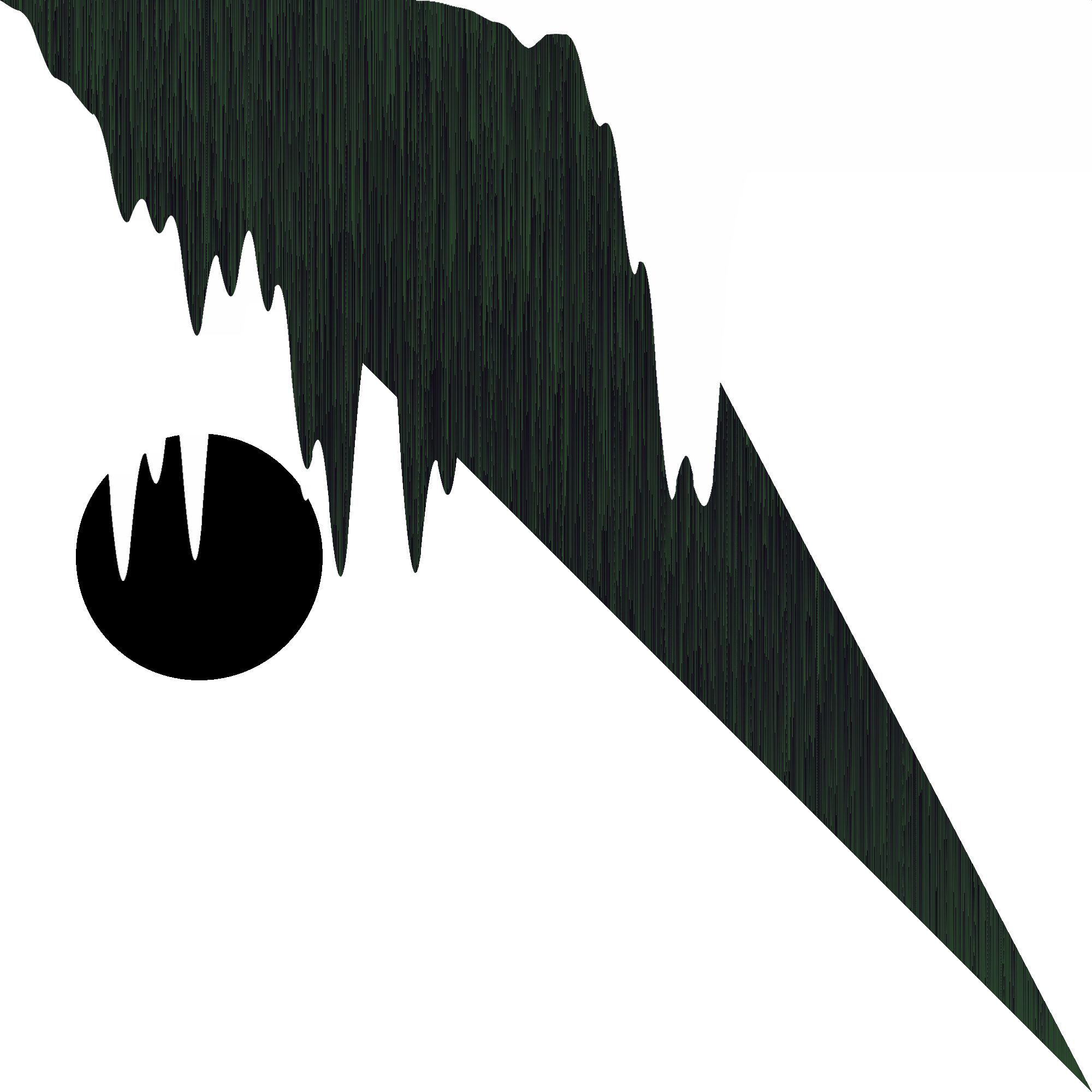 '
'
"clicks1" made for a modular track
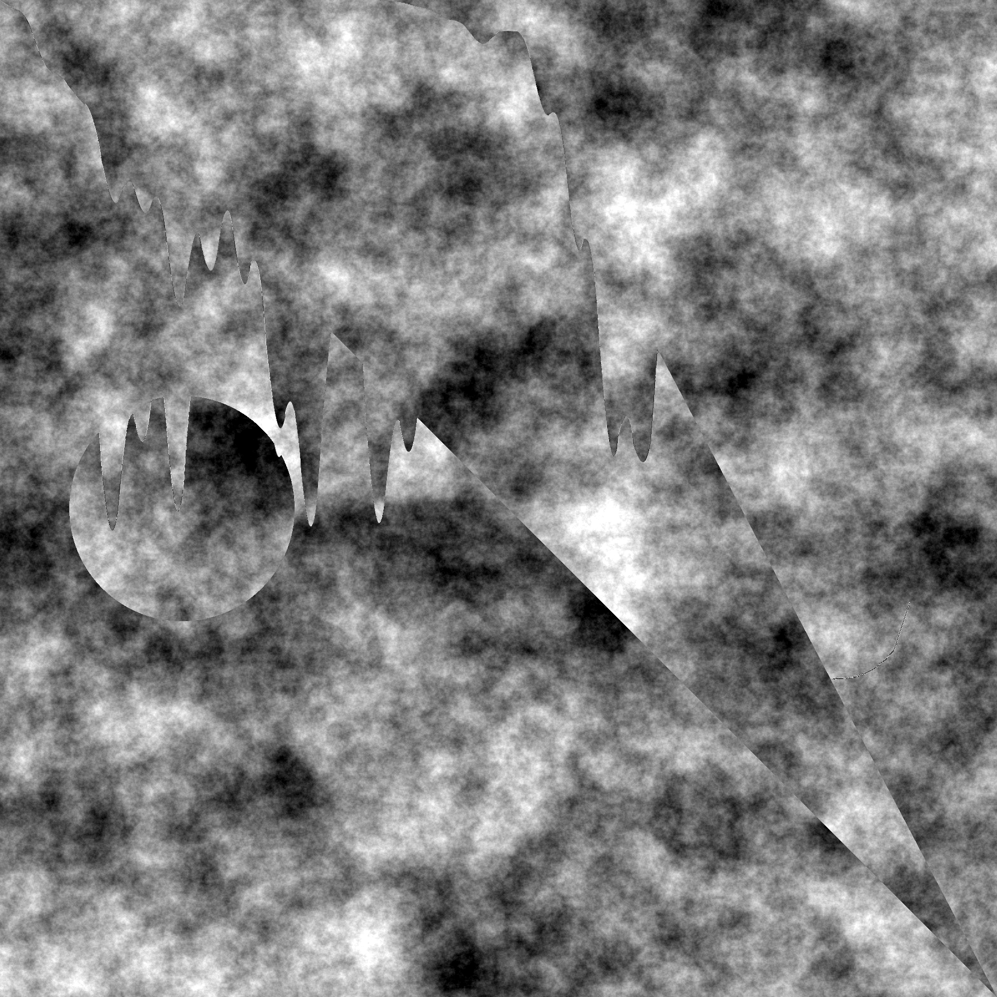
"clicks2" just the last one but i really liked how those shapes felt so i added some much needed texture
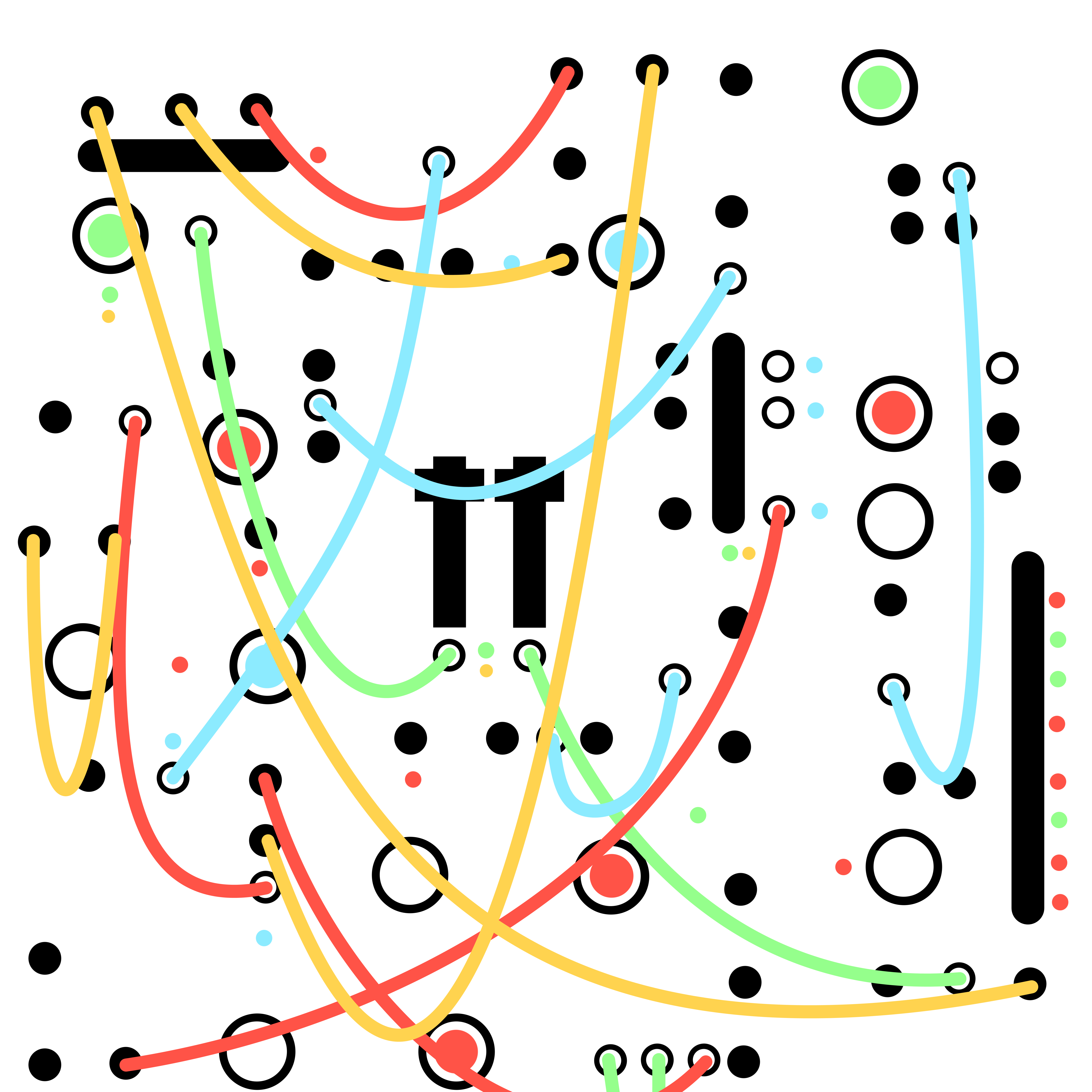
this is the pattern on my modular synth hoodie, which i am happy to say is the most compliments i get on any piece of clothing. feel free to get this printed on a hoodie (if u do send me a pic!)
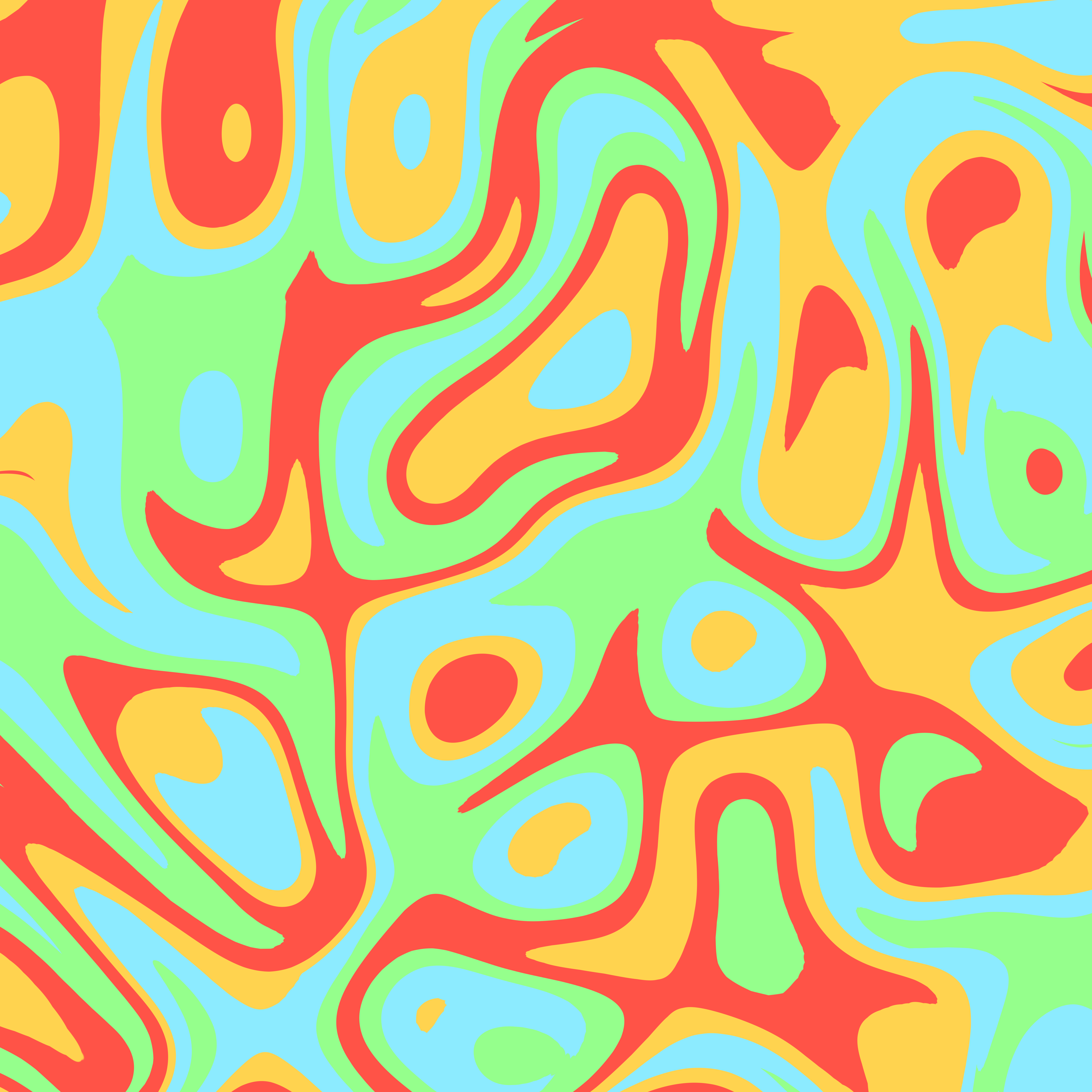
this is the pattern used on the hood and pocket of my hoodie
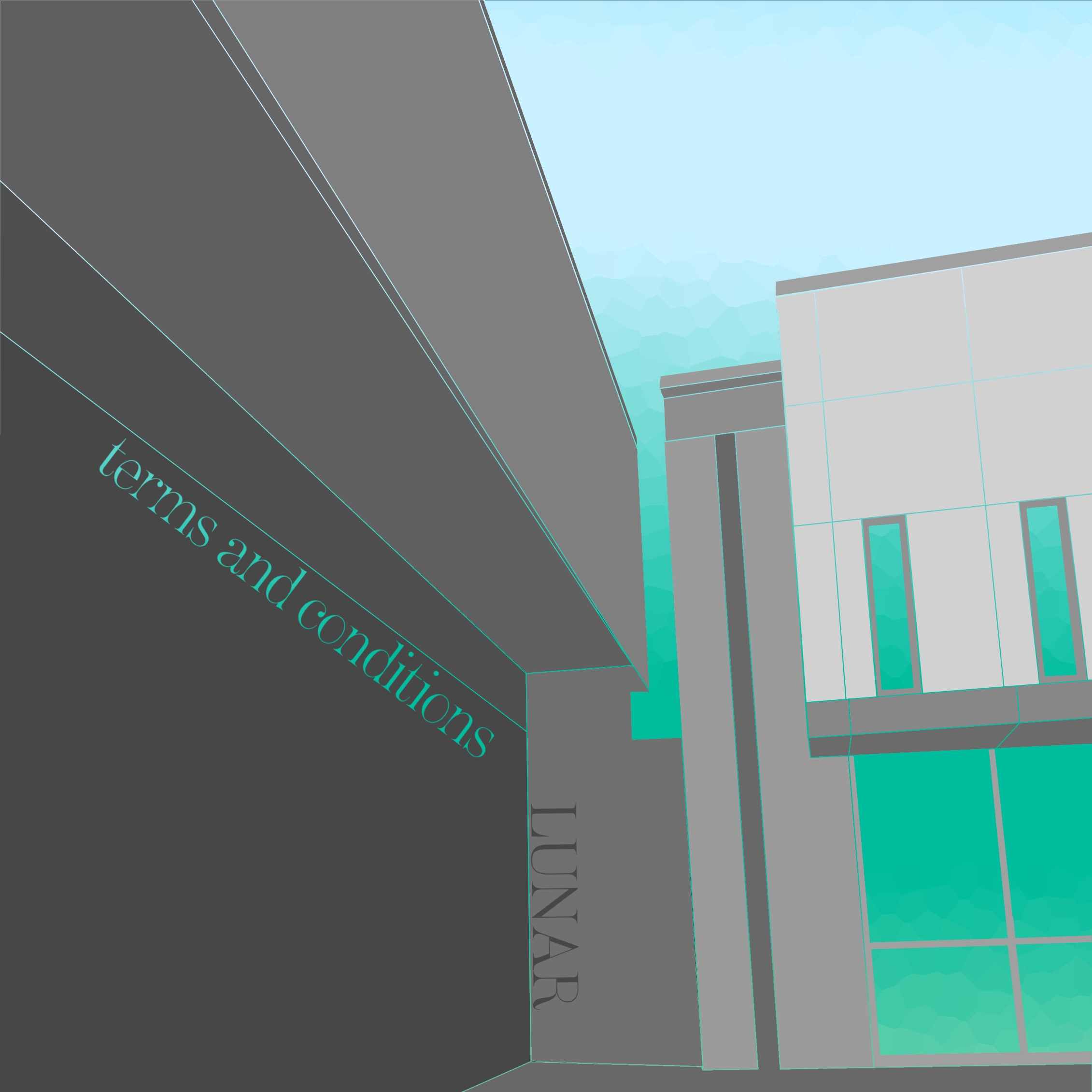
"lunar" this is the work i typically show people when i tell them that i do graphic design, it's very cool and isometric. the "terms and conditions" part was just from a random quote, i don't even remember what it was now...
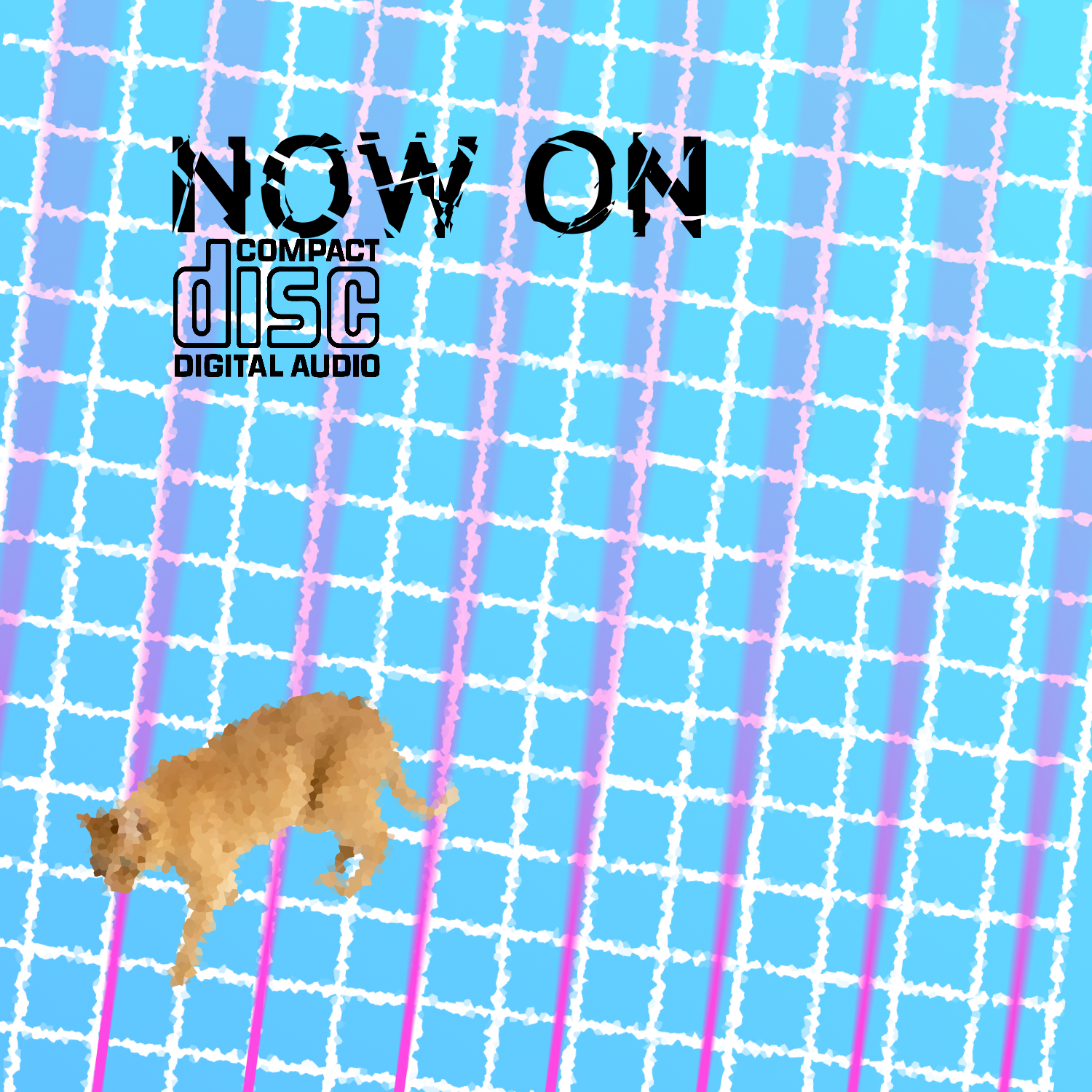
"cd" or, what if vaporwave emerged in 2040 and was about nostalgia for the early 2000s
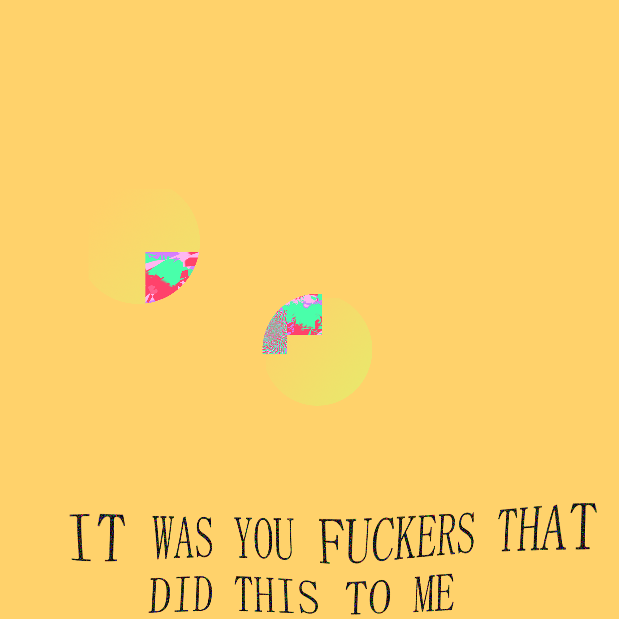
"YOU FUCKERS" very violent feeling, jarring and offset in a very unpleasing way
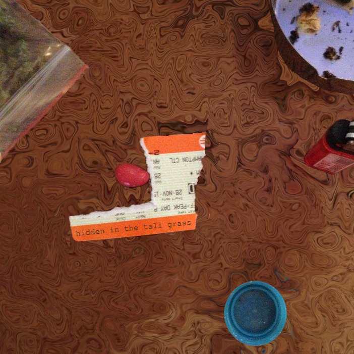
"hidden in the tall grass" this was when someone posted a pic of their table to a graphic design server on discord and said "challenge time make an album cover with my table :) so i did it
"motions" i was listening to a lot of alva noto and really liked the minimal art so

these four were for a project idea i had, "angry waveforms" of minimal, harsh, mainly frequency-relation based songs, and these are the covers. i ended up scrapping the project /shrug
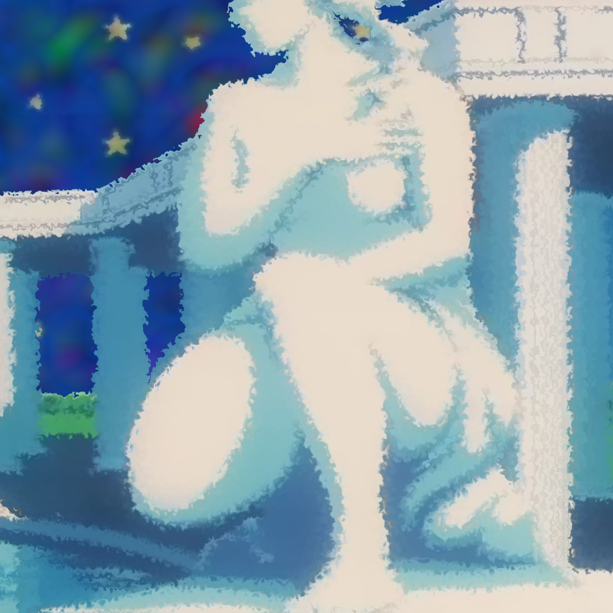
"statuette" was a cover for a potential album, "hibariwave", which i never finished (finding samples for that anime is hell) but there are still a few finished songs. maybe i'll still release it one day.
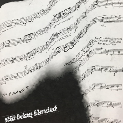
"still being blended" my strings teacher had a printer error and it looked cool
the top was the original, and the bottom is the remake. this is "towerrr", or the prime piece from my series of images called the "blackers", which i plan to make a page for soon. the point was that when you make the image really dark, in order to get any meaning from it you have to look rlly hard.
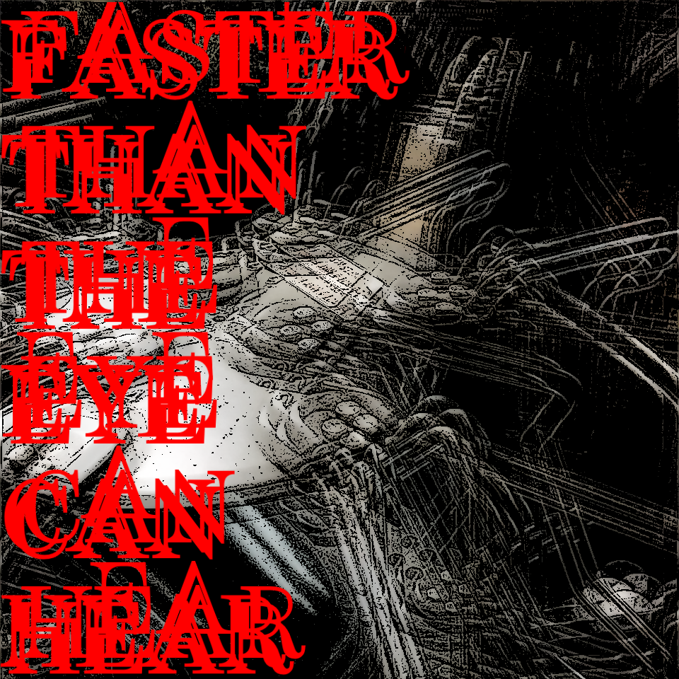
"FASTER THAN THE EYE CAN HEAR" this is like. kinda ugly and bad but whatever. it's a lane machine (the things in a bowling center)
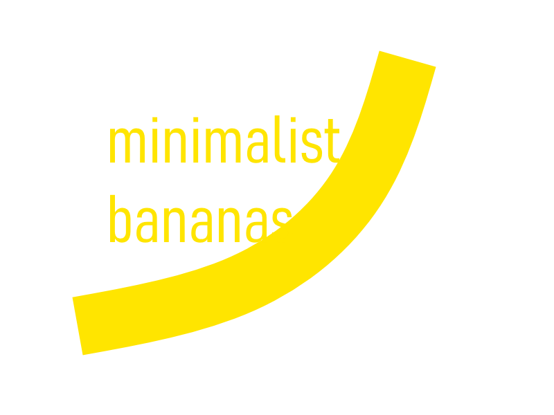
my friend made a joke that if you made a minimalist version of anything it will be famous. thus i made meme but it does look nice
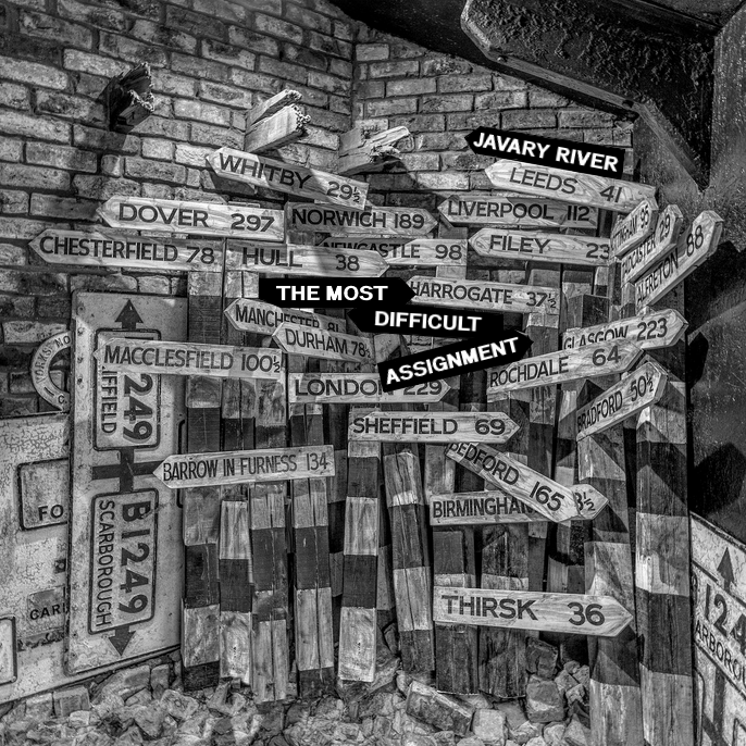
"THE MOST DIFFICULT ASSIGNMENT" this was something i made using the formula on /r/fakealbumcovers
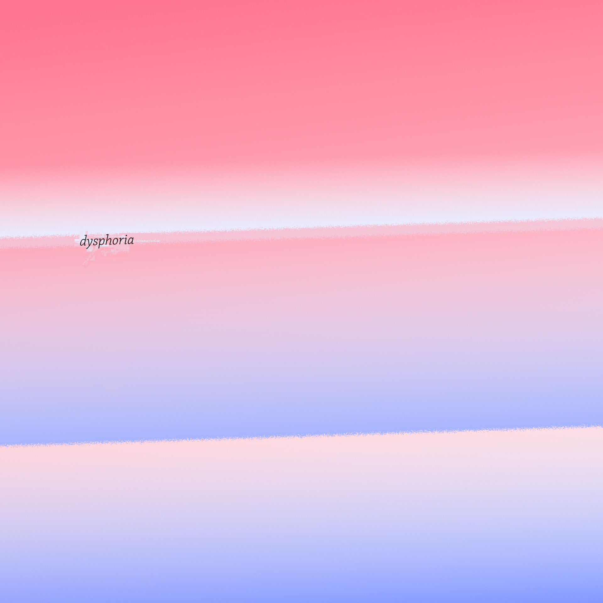
cover of my first released album, "dysphoria". you can no longer listen to it lol
this is the original gradient fuckup that i made on accident and then thought ooh pretty
man this shit sucks
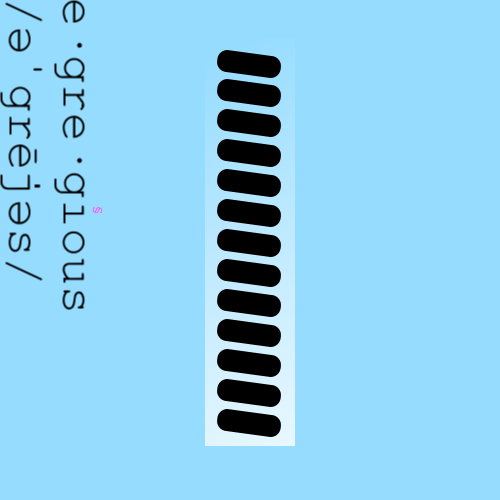
this was the first thing i made with the intent of it being an album cover instead of an icon or smth... the lines are like. ties on a rope (i was edgy and sad and yes there are 13 of them) it's not that bad but i'd get rid of the little symbol on the word egregious, or just change the color at least
lmao
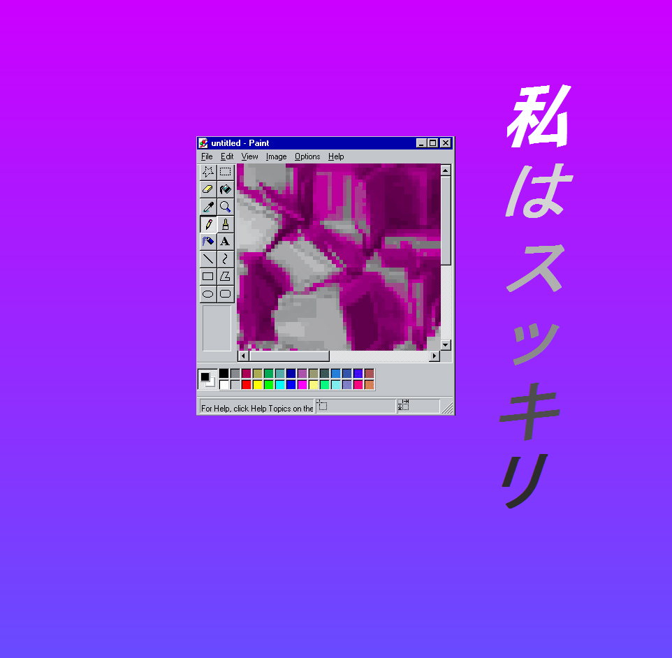
this was the oldest thing i could find, was used as an icon. it's shit